It is possible to create a variety of charts and graphs from the data you place in an Excel spreadsheet. These can then be copied into a Word document as part of a report, enlarged to print for a display, etc.
Creating the Graph | Copying to Word or PowerPoint
Excel will walk you through a Wizard to make chart creation easy. For this tutorial, the following data will be used:

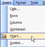
To start the Wizard, to to Insert/Chart:
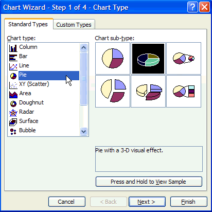
On the first page of the Wizard, you will select the type of chart you wish to create. For the purposes of this example, we will be suing a pie chart with visual 3-D effects, so that has been selected. Once you have selected a choice, click on Next.
In step 2 you will be selecting a data range. Please note that you are not only selecting the number data but also the text data that will be part of the legend for the chart. To select the range, click on the symbol the cursor is point to in the illustration below:
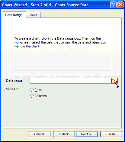
Once you click on this symbol, you will see the frame reduce in size. Click in the upper left cell of the ones you are using and drag it to the lower right cell of the selection. In the illustration below, the start cell for the click/drag was A3 and the end cell was B8.
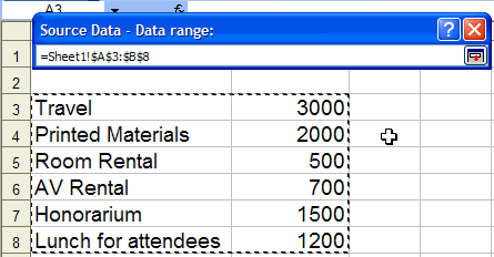
Once you have highlighted the
cells (they are enclosed by a dotted line) click again on the little symbol
on the Source Date - Data range: bar ( ![]() ).
).
This will bring up the following menu:
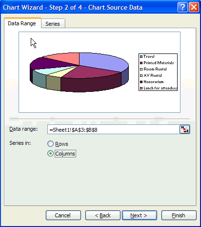
If the chart does not show properly, try both the Columns and Rows options. If it still doesn't work, go back to make sure you have the correct data source identified. When ready, click Next.
You will now see Step 3 of the Wizard:
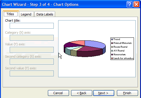
Type in the Chart Title for the chart. If this were a bar graph, you would also have the option to label the X and Y axis. You can also use the Legend tab and Data Labels tab to modify further how the information appears on your chart. You can add additional information to the chart using these functions. For now, we will type in the title and click Next.
The last step of the Wizard is shown below:
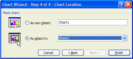
You have an option to place the chart in a new sheet in your Excel document (first option) or within the existing sheet (second option). After selecting, click Finish.
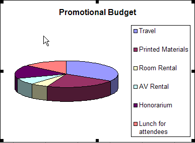
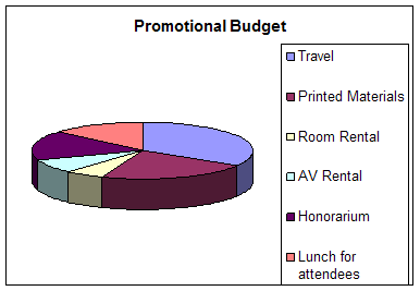
You will have created a chart:
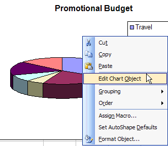
Once you have the chart done, you can still edit it without having to start over. Anywhere on the chart, right click and go to Edit Chart Objects. You can easily make changes once in the edit mode by double clicking on the item you wish to edit.
Once you have the final chart, you can click on that chart to highlight it (the corners will have small circles or boxes for handles).